I enjoy the color scheme and humor behind this photo.
Woo! Controlled chaos and prettiness!
I really enjoy the humor this photographer puts into his images, as you'll see in most of the pics in this post. =P
See? Here is more humor from this photographer, and he is still able to convey his message in a straight forward manner, too.
I love the mix of the natural and the unnatural in this image.
I love how the entire image is pretty, yet the focus is still on the subject.
This image appears to be an
advertisement for bug repellent. The
subject in the middle of the image appears cool and relaxed despite being
surrounded by a large mass of blood-sucking mosquitoes.
I
enjoy the composition of the image, utilizing the mass of mosquitoes to keep
the eyes focused on the girl. The colors
used also draw your eyes in. I think the
lighting is nice, as well. If I saw this
ad in a magazine, I would take a second look to see what kind of repellent it
was for because I find it interesting.
It maintains a level of interest, while also displaying what someone
would want from a repellent product.
The Three Blind Mice don't want cheese...they want contact lenses! lol
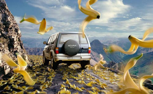
This car is so secure in corners, you can even trust it on banana peels!
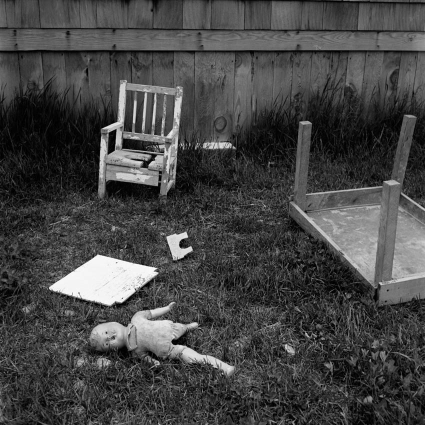
I'm not sure what it's advertising, if anything, but I like the image, nonetheless.
Also images in this post were by photographer Glen Wexler.